
2024/11/23 13:13
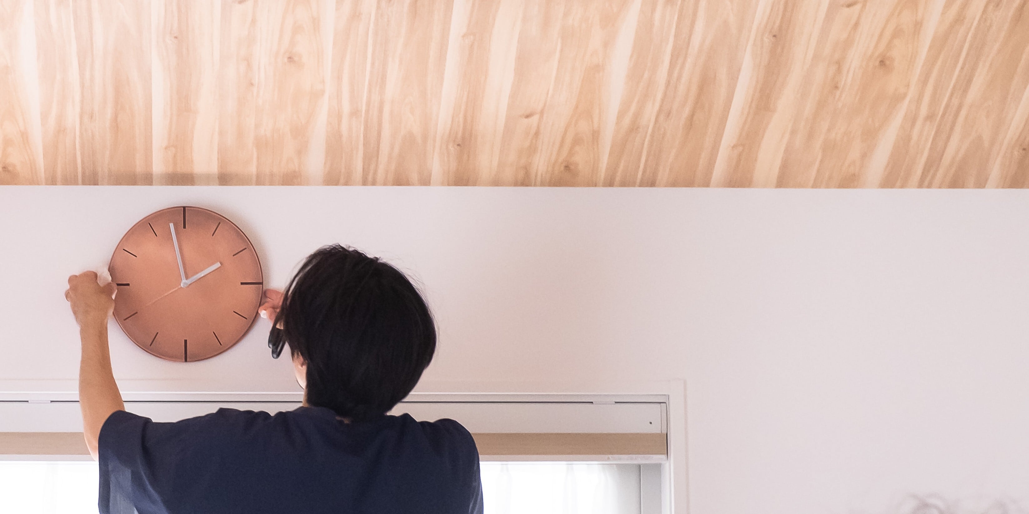
文字盤全面にめっき処理を施した、今までにない掛け時計です。 この時計の特徴は、めっき処理された文字盤がひかりを美しく反射・拡散し、朝、昼、夜と差し込む光によって刻々と表情を変えることです。従来の時計が「時間を読む」ものであったのに対し、この時計は「光の変化=時の流れ」を感覚的に楽しむことができるアイテムです。表面仕上げによって異なる各カラーの光の反射や質感を楽しめ、インテリアに自然になじみながら、光の角度や強さによって様々な表情を見せます。 見た目の重厚感とは対照的に、実際は軽量で画鋲一つで簡単に設置可能。スイープ式ムーブメントによる静かな動作も魅力です。単なる時間を知るツールではなく、日常空間に光の美しさと上質な時間をもたらす、新しいライフスタイルアイテムです。 The defining feature of this clock is its plated dial, which beautifully reflects and diffuses light, shifting its expression moment by moment as the sunlight changes from morning to day to night. While traditional clocks are designed merely to "read the time," this piece allows you to intuitively enjoy the flow of time through the changing light. You can appreciate the unique reflections and textures of each color finish, which blend naturally into any interior while revealing different facets depending on the angle and intensity of the light. Despite its substantial, weighty appearance, it is remarkably lightweight and can be easily mounted with a single thumbtack. The silent sweep movement also adds to its appeal. This is more than just a tool for telling time; it is a new lifestyle item that brings the beauty of light and a sense of refined quality into your daily space. φ260の掛け時計は、裏面も鏡のようなフラットな仕上がりになっています。 「ひかりを楽しむ掛け時計」は、裏面に至るまで“光”そのものを楽しんでいただけるよう設計しています。 装飾的・構造的な要素を極力排除し、通常であれば「非有効面」とされがちな部分すらも“見せる”デザインの一部=「有効面」として扱いました。 そのため、凹凸のないフラットな裏面に仕上げることで、まるで鏡のように光を反射し、時計を裏返した状態でも美しさが損なわれない仕様を実現しています。 Our "Wall Clock for Enjoying Light" is meticulously designed to allow you to experience light itself, even from the reverse side. By minimizing decorative and structural elements, we have transformed what is typically considered a "non-functional surface" into an "active" part of our design. We achieved a perfectly flat, seamless back that reflects light like a mirror, ensuring that the clock maintains its beauty even when viewed from behind. このめっき加工はプラスチックの文字盤に対して施しています。仮にこの文字盤と同質量の金属素材を使用した場合、本体重量は数倍に達してしまいます。 この技術はもともと金属素材からの代替目的として発展してきた歴史があり、自動車部品の軽量化、それに伴う省エネ化に大きく貢献してきました。 本物の金属の見た目を持ちながら、金属よりもはるかに軽量なこの時計は、女性やこどもが片腕で設置することも容易な重量です。この軽さのおかげで、壁にビス打ちなどをすることなく、一般的な画鋲でセッティングすることができます。 This plating is applied to a plastic dial. If we were to use genuine metal with the same volume, the clock would be several times heavier. This technology was originally developed as a lightweight alternative to solid metal, significantly contributing to the weight reduction and energy efficiency of automotive parts. By combining the authentic look of real metal with a drastically reduced weight, our clock is light enough to be installed easily by women and children with one hand. This lightweight design allows you to mount it securely with a simple thumbtack, eliminating the need for screws or drilling into your walls. パッケージは、商品現物よりも先にお客様の目に、手に触れる「ブランドの顔」ともいえる大事な要素です。 箱の製法には、以前店頭で見て個人的に関心を持っていた「Vカット製法」を選定しました。 貼り箱でありながらエッジが際立つ形状が特徴で、そのインダストリアルな雰囲気が商品自体はもちろん、町工場をルーツに持つ私たちのブランドの雰囲気にもマッチすると考えました。 表面にはグレー色の「竹尾ペーパー」を貼り、中央には箔押しによって輝くブランドロゴを配置。 モダンながら親しみのある仕上がりとなっています。さらに、内側全面に紙を貼る「内面合紙」という質の高い仕上げを採用しました。プロダクトにおける「裏面までも美しく」という考え方と同様に、箱の内側までMYSTIC WORKSの世界観を表現する、妥協のない仕上がりを追求しています。 The packaging serves as the "face of the brand"—the very first element our customers see and touch before encountering the product itself. For the box, I selected the "V-cut" method, a technique that has personally fascinated me since I first saw it in stores. This style is characterized by sharp, distinct edges, which I felt perfectly matched the industrial atmosphere of our products and the heritage of our brand, which is rooted in a local factory. The exterior is wrapped in gray "Takeo Paper," featuring our brand logo embossed in foil at the center for a brilliant touch. The result is a design that feels both modern and approachable. Furthermore, we adopted a high-quality "interior lining" finish, where paper is applied to the entire inner surface. Just as we hold the philosophy that a product should be "beautiful even from behind," we have pursued an uncompromising finish that extends the world of MYSTIC WORKS even to the inside of the box. 工場には一日に数千〜数万個の製品を生産する自動ラインがありますが、私たちはカスタムメイドが可能な小規模ラインも有しています。MYSTIC WORKSのアイテムの大部分は、この小規模ラインで人の手によってめっきが施されています。 なかでも一部のカラーコンセプトは量産ラインでは生産ができない技術を用いており、技術者が状態を見ながら一つひとつ丁寧に仕上げています。 While our factory is equipped with automated lines capable of producing thousands to tens of thousands of units daily, we also operate smaller, customizable production lines. Most MYSTIC WORKS items are plated by hand on these smaller lines. In particular, some of our color concepts rely on specialized techniques that cannot be replicated on automated mass-production lines; instead, they are meticulously finished one by one by our skilled technicians, who monitor their condition throughout the process.ひかりを楽しむ掛け時計 MYSTIC CLOCK
A wall clock unlike any other, featuring a surface entirely finished with our signature metal plating.
裏面までも美しく
Beautiful Even from Behind
Our 260mm diameter wall clock features a seamless, mirror-like finish on the back, ensuring beauty from every angle.
軽量で手軽な設置
Lightweight and Easy to Install
Another key feature is that it is surprisingly lightweight—far lighter than its appearance suggests.
こだわりのパッケージ
Premium Packaging

手作業による仕上げ
Hand-Finished Craftsmanship